Product Photography Tips for Sharper Listing Photos
Summary
The product photography tips that matter most are soft side light, a clean first frame, a fixed angle system and five to eight images per listing. Shoot with a phone near a window plus a white reflector, batch your edits, and check every result at thumbnail size. Use AI tools for background swaps and seasonal refreshes only after the raw photo is sound, and always compare the output with the real product before publishing.
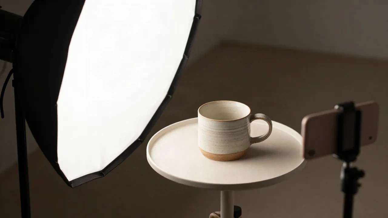
The product photography tips that move the needle are boring ones: soft light from one side, a clean background, a consistent angle, and five to eight frames per listing. Get those four right with a phone and a window, then let AI handle the rest, meaning background swaps, seasonal refreshes and cleanup. Skip the gear upgrade until your light is fixed. This guide covers the shoot, the edit, and the limits of each step.
Which product photography tips matter before you buy any gear?
Light first. Every other decision is downstream of it.
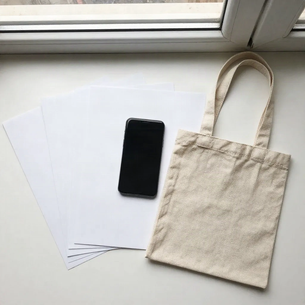
A cheap phone in good light beats a mirrorless camera in a dim room. If you shoot next to a window, put the product at a right angle to the glass so light rakes across it from one side. Add a white foam board on the opposite side to bounce light back into the shadows. That is the whole studio.
Natural light drifts, though. A gallery shot at 10am and another at 2pm will look like two different shops. Shopify's DIY photography guide makes the same point and recommends a softbox once you shoot regularly, because a steady source keeps the whole catalog looking even.
In practice, a first setup takes about 25 minutes to build and costs less than a pair of decent sneakers. A tripod, a poster board, a foam board, one softbox. Nothing else is required.
What does a listing actually need: white background or lifestyle?
Both, in a fixed order. The first frame is a clean cutout-style shot, because marketplaces and Google Shopping favor it and because it makes your thumbnail readable in a grid. Frames two onward do the persuading.
A workable sequence for a small-catalog seller:
Hero on white or a very light neutral, product filling about 80 percent of the frame
Second angle, usually three-quarter view
Detail shot that proves quality (texture, stitching, glaze, weave)
Scale shot, with a hand or a familiar object
Lifestyle shot in a believable room
Packaging or what arrives in the box
Five to eight frames is the normal range on Shopify and Etsy. More than that and shoppers stop swiping, fewer and you leave objections unanswered. The right number is the number of questions a buyer would ask in a shop.
Skip the pure white background for everything if your product is white. A white mug on white paper vanishes. Use a light warm grey instead, and keep it identical across the catalog so the grid looks intentional.
How do you shoot the detail frame that sells the price?
The detail shot is where handmade and mid-priced products win or lose. It has to answer one silent question: is this worth what it costs?
Get close, then get closer than feels comfortable. Use side light so texture throws tiny shadows. Straight-on light flattens a glaze or a fabric weave into a printed pattern. Tap to focus on the surface you want sharp, lock exposure, and shoot at the phone's native zoom rather than digital zoom, which softens edges.
Works best on: ceramics, leather, knitwear, jewelry, anything with a surface. Struggles on: shiny metal and glass, where reflections show you and your room. Use a white card to control what the surface mirrors, or shoot at a slight angle.

What separates a lifestyle shot that converts from one that just decorates?
Believability. A lifestyle shot has a job: let the buyer place the product in their own home or hands. Props should support the scale and use of the product, not compete with it.
Three rules I use when I stage a set:
One hero, two supporting props at most, all in the same color family
The product sits at a real height (shelf, table, counter), not floating on a seamless
Light direction matches your other frames, so the gallery reads as one shoot
The trouble is cost. Building five different rooms for one listing is a day of work. That is where the AI layer earns its place, and where honest limits matter, so it gets its own section below.
Where does AI fit in a product photo workflow?
After the capture, never instead of it. AI tools are strong at three jobs: swapping or extending backgrounds, refreshing a scene for a season, and cleaning up small flaws. They are weak at anything that requires the model to invent product detail it never saw.
That distinction decides which tool you pick.
Dedicated product-photo platforms are built to preserve the item. Klayn turns one product photo into a set of studio scenes and keeps décor and direction consistent across a collection, which is the hard part when you are shooting 200 SKUs. Photoroom covers background removal, batch edits and marketplace sync in one place. Claid.ai trains on product photography specifically, so it prioritizes logos, shape and texture over aesthetics.
Photospells sits on the creative side of that split. Spells like Scene Shift change the setting around a product, and Season Swap moves a shot from summer to autumn without a reshoot. It is faster for stylistic changes. It is not the tool for print-scale upscaling, where a specialist like Topaz is better, and it can drift on products with fine printed text.
Two habits keep AI edits honest. First, always check the edited image against the physical product: color, proportions, logo, stitching. Second, never let an AI scene change what the item looks like, because returns from "not as pictured" cost more than the reshoot would have.
How do you keep a whole catalog looking like one shop?
Consistency is a system, not a mood. Decide five things once and write them on a card beside your set:
Camera height and angle for each frame type
Background color (one hex value, if you are editing digitally)
Crop ratio and how much margin surrounds the product
Light direction
File specs: export at the size your platform wants, keep files compressed so pages stay fast
On sizing, err larger than the container. Shopify's own advice is to size images bigger than the display area so they stay sharp on high-resolution screens, then compress them. A common target is around 2000 pixels on the long side and a file weight well under 500 KB, though your theme may differ, so check it.
For batches, shoot every product in the same session with the same setup, then edit as a set. Ten minutes of batch work on a shared preset beats two minutes of tweaking each image separately. This is also where batch tools pay off: apply one background and one crop rule across the folder, then review the outliers by hand.

Which mistakes quietly cost you sales?
Most bad listing photos fail in the same handful of ways. None of them need expensive fixes.
Mixed light sources. A warm lamp plus cool window light gives you two color casts on one product. Turn the lamps off or cover the window and use one source.
Wrong white balance. A white box that looks grey or yellow tells shoppers the whole photo is unreliable. Set white balance manually, or shoot a grey card once and correct from it.
Over-editing. Heavy saturation makes the product look different from what arrives. Returns follow. Keep edits small and truthful.
Inconsistent crops. A grid where some products fill the frame and others float in the middle reads as amateur even if each shot is decent alone.
No scale reference. Buyers cannot judge size from a product on a blank background. Add a hand, a coin, or a dimension callout in the description.
Ignoring mobile. Most shoppers view on a phone. Check every hero at thumbnail size before you publish. If the shape is not readable at 200 pixels wide, reshoot or recrop.
The friction I keep running into: AI backgrounds look great on solid, matte products and struggle with glass, glossy packaging and anything transparent. Edges halo, reflections contradict the new scene. For those products, shoot the lifestyle frame for real and use AI only for the white hero.
Should you build the workflow around your store platform?
Partly. Your platform decides file limits, gallery layout and what buyers see first, so the photo plan should follow it. Etsy leans toward lifestyle imagery in the gallery. Shopify themes vary widely in crop and zoom behavior. Amazon-style marketplaces want a strict white hero.
If you are still choosing where to sell, pick the platform on shipping, fees and audience before you tune photos to it. For sellers who want an all-in-one store with built-in SEO and product-description automation, WiziShop is one option worth comparing against Shopify.
Whatever the platform, test one change at a time. Swap the hero on your ten best sellers, wait two to four weeks, compare click-through and conversion, then decide whether to roll the change out. Photography advice from any blog, this one included, is a hypothesis until your own numbers confirm it.
What would we actually do this week?
Start small and in order.
Fix the light: one window or one softbox, one reflector, phone on a tripod
Reshoot your five best sellers with the six-frame sequence above
Write your consistency card (angle, background, crop, light, file specs)
Use an AI tool for the white hero or one seasonal lifestyle frame, and check it against the real product
Track click-through for a month before touching the rest of the catalog
Do that and you will have better product photography than most listings in your niche, without a studio, and you will know which parts of the process deserve real money later. Cast the AI step last, when the raw photo is already solid.